Opened 15 years ago
Closed 14 years ago
#47 closed defect (fixed)
Realign the icons above the personal stats on the map
| Reported by: | Henrik Heimbuerger | Owned by: | MrWabbit |
|---|---|---|---|
| Priority: | major | Milestone: | 1.80 |
| Component: | HUD: GlassHUD | Version: | dev |
| Keywords: | goodfirstbug | Cc: |
Description
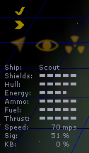
The autopilot/eyed/cloaked/vector lock icons should be properly Y-centered between commands and the personal stats display.
The distance between the autopilot/seen/VL on the in-flight map isn't consistent. I think the leftmost one should be left-aligned with the text, the rightmost one right-aligned with the bars and the middle one centered.
A mockup is attached (regarding X/Y positions only).
Attachments (2)
.png)
.png)
Change History (5)
Changed 15 years ago by
| Attachment: | state map icons.png added |
|---|
Changed 15 years ago by
| Attachment: | state map icons (mockup).png added |
|---|
quickly hacked together mockup, only to show the idea of both X and Y position, not pixel perfect
comment:1 Changed 15 years ago by
| Owner: | Bunnywabbit deleted |
|---|---|
| Status: | new → assigned |
comment:2 Changed 14 years ago by
| Owner: | set to MrWabbit |
|---|
Note: See
TracTickets for help on using
tickets.
current state (as of r125)